Big Data is huge. But as important and useful as it can be, when presented in spreadsheets, it becomes excruciatingly boring! Sifting through huge piles of information to derive any meaningful insight is also difficult. And to top it all, when working directly with data, it’s easy to miss crucial bits of information that could potentially affect the outcome.
Research proves that the human brain processes visualizations better. And that’s where data visualization comes in handy! Data visualizations present clusters of data in an easy-to-understand layout. They can be either static (like graphs, charts, infographics, etc.) or interactive (where the viewer digs deep and interacts with the representation to gain more insights).
Related reading: Top 15 Data Visualization Tools
And data visualizations are super interesting! Intuitive and easy-to-understand, visualizations have long been a favorite pastime for data geeks. We’ve scoured the web to collate some of the best and most interesting data visualization projects for you – read on to find out more, and to learn how you can work on your own projects in no time, too!
Learn to communicate complex ideas visually and captivate your audience with Simplilearn's comprehensive data visualization courses.
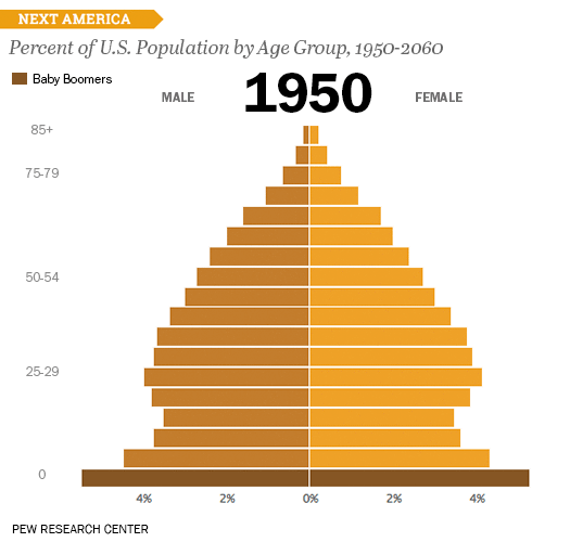
1. Percent of U.S. Population by Age Group
This captivating data visualization by Pew Research represents the changing face of US demographics over a period of time. Bar charts are employed to great effect in this visualization. The darker shade -indicative of baby boomers- is distinctive as well. Overall, the graph is set in the most interesting and simplistic way possible. This visualization tops our list!
2. Satellites Orbiting Earth
Based on a database compiled by the Union of Concerned Scientists, David Yanofsky and Tim Fernholz had composited an interactive data visualization. This mind-blowing graph presents a visualization of the 1,200+ satellites orbiting earth. It includes data on the launch weight, path/region in which the satellite orbits, satellites that provide broadband internet, GPS, and Sirius XM, and so on, into a single graph.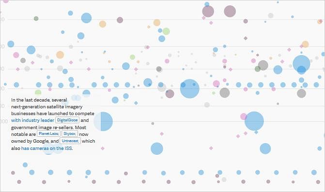
Check here for the original interactive version.
3. Gender Pay Gap-US
Another compilation based on data from the US Bureau of Labor Statistics by David McCandless team, this visualization presents salary information by gender for the US region. The representation includes information from various sectors like Media, Sales, Law, Education, Manual Labor, Science, Tech and Engineering, and more. On his site - InformationisBeautiful.net, David further breaks down this data visualization into simpler graphs that indicate the highest paid US men’s and women’s jobs and widest and narrowest gender pay gaps in the US.
Here’s the complete static data visual.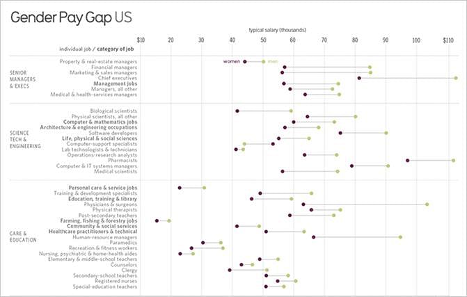
Source: Informationisbeautiful.net
4. What’s Really Warming the World?
Are you an ecologist? Or a considerate human being concerned about leaving behind a better planet? This interactive data visualization by Bloomberg Business is sure to grab your attention. The graph not only compares the different influential factors that have contributed to the rising temperature in the earth’s atmosphere, but also helps readers arrive at an answer to the question of what really is warming up the world. 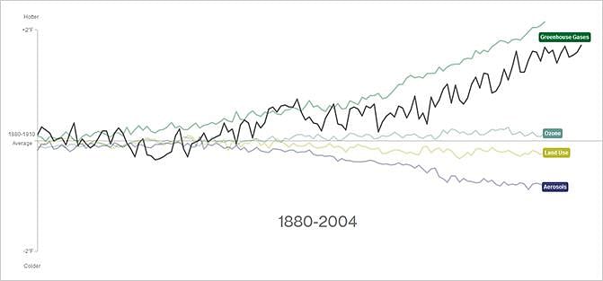
Check here for the original interactive version.
5. The Depth of the Problem
Richard Johnson and Ben Chartoff of The Washington Post came up with a lengthy infographic to help us understand the depth of the oceans to shed some light on the disappearance of the Malaysian Boeing 777-200ER flight. The research data was collected from a variety of sources, including the Australian Maritime Safety Authority, Hydro International magazine, National Oceanic and Atmospheric Administration, BBC.co.uk, and Plosone.org. Illustrations of the world’s tallest buildings, such as the Burj Khalifa, are also presented for scale. 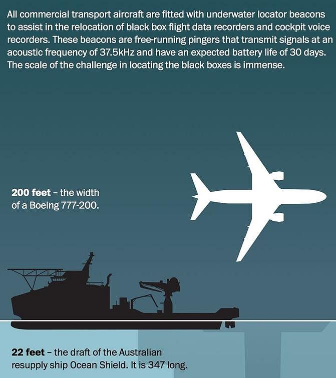
6. NYC Street Trees
Compiled with information from NYC Open Data, this data visualization offers valuable information about the wide variety of trees that adorn the streets of New York City. This interactive graph covers the more than sixty-seven genii of trees that are cultivated in all the five boroughs of New York – Bronx, Brooklyn, Manhattan, Queens, and Staten Island.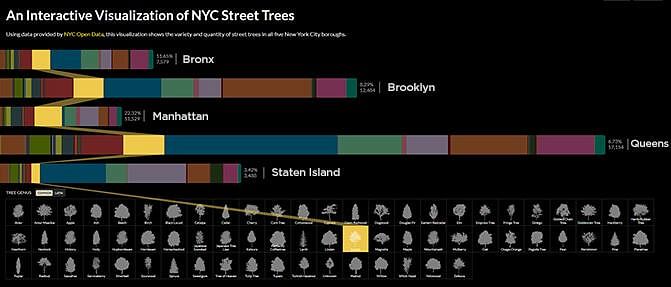
Check here for the original interactive version.
7. Wind Map – US
An interactive Wind Map of the United States offers information on the current wind speeds and direction in real time. The map simple, clear, and informative.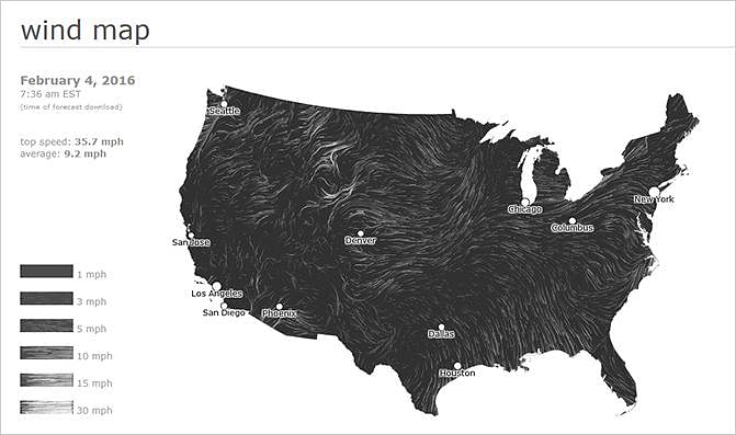
Check here for the original interactive version.
8. Hans Rosling’s 200 Countries, 200 Years, 4 Minutes
And let’s not forget the famous Hans Rosling’s video – The Joy of Stats- that went viral. The statistical documentary by the Global health data expert, Hans Rosling, first aired on BBC in 2010, is a presentation of complex data relating to the converging stats of wealth and health across 200 countries, over 200 years. Rosling has effectively tried to squeeze the immense volume of data into a video that is only 4 minutes in duration. Watch the astounding video here!
9. The Daily Routines of Famous Creative People
And now for something different!
We came across yet another interesting information visualization that illustrates the daily routines of famous creative people – writers, poets, artists, and others. You may have seen this trending on social media sites, recently.
The graph covers the everyday activities of famous creative people. When you hover over this interactive visualization, a short-description of the personality in focus and some information on what they do during their routine activities is clearly laid out.
This catchy interactive data visualization is bound to interest artsy people.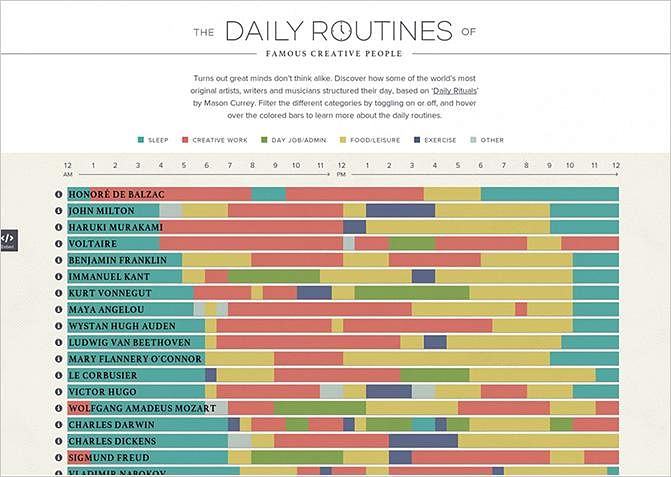
Check here for the original interactive version.
10. Non-fiction Books Everyone Should Read
Here’s one for all the book-lovers!
Based on data collected from awards, review sites, and the public, this interactive word-cloud represents clusters of non-fiction books. Clicking on the names of the books will lead you to the Amazon web page, from where you can purchase the book. You can also click on your favorite non-fiction genre – social, biography, science, philosophy, history, guidebook, and political – from below the list of books and choose from the filtered list.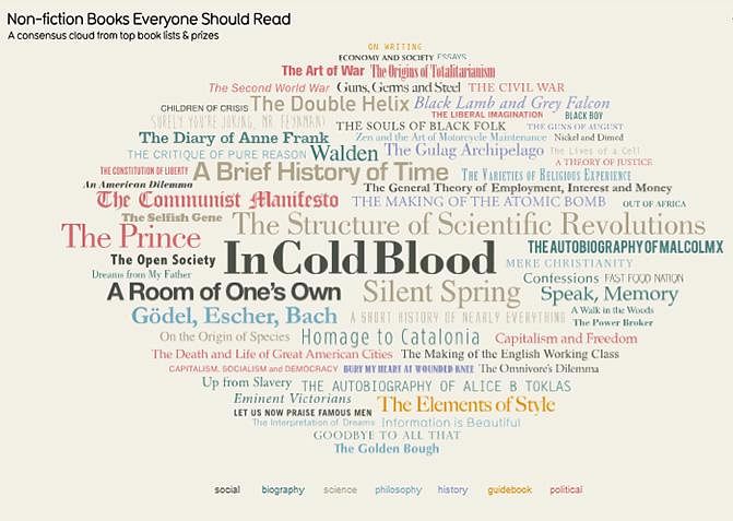
Check here for the original interactive version.
Choose and Enroll In the Right Data Science Program
Inspired by all these mind-blowing visualizations? Want to learn everything you can about data science and work on projects of your own? Our Data Science courses are meticulously designed to furnish you with the necessary skills and knowledge to excel in this swiftly evolving industry. Below is a comprehensive comparison to aid in your understanding:
Program Name Data Scientist Master's Program Post Graduate Program In Data Science Professional Certificate in Data Analytics and Generative AI Geo All Geos All Geos All Geos University Simplilearn Purdue Purdue Course Duration 11 Months 11 Months 8 Months Coding Experience Required Basic Basic Basic Skills You Will Learn 10+ skills including data structure, data manipulation, NumPy, Scikit-Learn, Tableau and more 8+ skills including
Exploratory Data Analysis, Descriptive Statistics, Inferential Statistics, and more11+ skills including
Data Analytics, Data Ethics, ETL,
Data Visualization, and moreAdditional Benefits Applied Learning via Capstone and 25+ Data Science Projects Purdue Alumni Association Membership
Free IIMJobs Pro-Membership of 6 months
Resume Building Assistance14+ Data Analytics Projects with Industry datasets from Google PlayStore, Lyft, World Bank etc. Cost $$ $$$$ $$$$ Explore Program Explore Program Explore Program
With a meticulously devised learning path and expert mentorship from industry insiders, our Data Scientist Masters Program is designed to help you become a data expert! Explore and enroll now.
